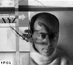
El Lissitzky, Self-portrait, 1924.
An eye was, also, what the revolutionary French police of the nineteenth century chose for its emblem.
This coincidence provides a different angle to view one of the most fundamental ethical arguments of graphic design: that it helps share knowledge and ideas, thus empowering people. By its knowledge and skill, graphic design certainly has increased visibility of the world, satisfied the appetite for seeing, knowing, and acquiring. And one of the most vivid realizations of this desire for visual knowledge, for which graphic design has been both a reflection and a particular technique, is the world of surveillance, the technology to gain knowledge of individual bodies to manage and regulate them.
Lest we forget, surveillance is not simply a means of control practiced exclusively by such exterior bodies as the state, the military, or the police. It is both an idea and a technique widespread in modern society, possibly shared and practiced by all members. No 'Big Brother' is clearly separated from any other part of the society: everyone is a potential agent, and the 'unblinking eye' is everywhere, therefore nowhere. Thus, the eye in posters, logos and book covers is the eye of the witness, the reporter, the mediator, the audience, and the spying police, all at the same time. Or perhaps, is there a disembodied network of numerable eyes that can be appropriated by different bodies but may always create the same effect?
Without light, however, an eye is nothing but a vulnerable sensory organ. Thus, at the end of 1848 Revolution, the crowd in Paris was reported to destroy public clocks in fear of darkness coming, and began to request artificial lighting on every corner of the streets, as if the wicked force of the old regime would be emitted from shadows. Illumination became both a metaphor and a means for security, making visible everything to form a ‘total image’ of society.

Now, about one and a half century after the Revolution, we witness the artificial lights craved by revolutionary Parisians have been replaced by cctv surveillance cameras erected on the metropolitan streets.
 Everything turns visible under the illuminating light of the surveillance
technology; due to 'biometric' systems, cameras can recognize your face;
the Global Positioning System can point out your exact location; your personal
telephone conversations can be monitored and recorded for future reference;
and your everyday transactions can be tracked down to the minutest detail.
At least in theory, nothing can be hidden.
Everything turns visible under the illuminating light of the surveillance
technology; due to 'biometric' systems, cameras can recognize your face;
the Global Positioning System can point out your exact location; your personal
telephone conversations can be monitored and recorded for future reference;
and your everyday transactions can be tracked down to the minutest detail.
At least in theory, nothing can be hidden.In order for the illumination to work properly, however, some things should be hidden – a recognized spy is not a spy anymore. The agents of surveillance must be kept out of view, unless the purpose is a warning. Its technological configuration, its exact way of working is also supposed to be unknown. Indeed, the power of ubiquitous surveillance lies in the fact that one cannot assure when, where, what is watching you, and it is this uncertainty that forces one to be always vigilant and accept a form of self-regulation.
Sometimes, however, the best way to hide something is not hiding at all. Or, sometimes, one can provide misleading information to conceal the very fact that something is hidden. Therefore, the art of surveillance and control is how to manage the visible and the invisible; it is a game of revealing and hiding, knowledge and deception. If there is something like the existing regime of surveillance, it must be based on a certain relationship between two terms. To subvert it and win the game, one should be able to understand the relationship and play upon it, just like Auguste Dupin did to find his client's letter, which had been stolen and kept hidden in the thief's dwelling in Edgar Allan Poe's 'The purloined letter':
But the more I reflected upon the daring, dashing, and discriminating ingenuity of D—; upon the fact that the document must always have been at hand, if he intended to use it to good purpose; and upon the decisive evidence, obtained by the Prefect, that it was not hidden within the limits of that dignitary’s ordinary search — the more satisfied I became that, to conceal this letter, the minister had resorted to the comprehensive and sagacious expedient of not attempting to conceal it at all.

As it is unmistakably visual by nature, this race of (in)visibility has found its echoes in the realm of visual arts, too. In the following sections, I will discuss some attempts made by artists and designers to disrupt the existing dichotomy of the visible and the invisible, or to draw new maps of changing territory of the in/visible. I do not claim, however, an exhaustive list of examples. This essay is an informal, loose attempt to define surveillance as a general visual phenomenon; to articulate its connection to graphic design on the basis of a larger problem of vision and knowledge as power; and locate it in a broader historical context.
Nowhere else is perception more critical than on battlefields. Rapid and accurate perception of the enemy's movement has always been pivotal for victory, but this became more complicated during the twentieth century, as the technological development of war machine has rendered direct, unmediated perception almost impossible. World War I was the first major war of the century that clearly represented changing visibility of battlefields. While, due to the increased precision and speed of weaponry, perception itself has become destruction, widely adopted technique of trench warfare made it extremely difficult for individual soldiers to perceive an entire battlefield. As a result, military perception became highly abstract and centralized, and the communication between the data processing center and the troops dispersed in the field became much more important. Another factor regarding the visibility of a World War i battlefield was the introduction of chemical weapons such as chlorine and mustard gases. Now soldiers had to track the completely invisible threats, as well as trajectories of bullets and shells.

The zigzag pattern created by the trench systems of World War I.
This experience of abstract, remote sense must have been frustrating, and raised fundamental questions about the nature of perception, recognition, and communication. It was not only on battlefields, however, where this crisis in perception began to be felt. Walter Benjamin, among others, once described the increased speed and intensity of stimuli in modern metropolis: 'Moving through this traffic involves the individual in a series of shocks and collisions. At dangerous intersections, nervous impulses flow through him in rapid succession, like the energy from a battery'.
 In this stressful situation, 'normal' perception could produce in traumatic
effect. Susan Buck-Morss elaborates Benjamin's diagnosis: '[perceptions]
that once occasioned conscious reflection are now the source of shock-impulses
that consciousness must parry. In industrial production no less than modern
warfare, in street crowds and erotic encounters, in amusement parks and
gambling casinos, shock is the very essence of modern experience'.
In this stressful situation, 'normal' perception could produce in traumatic
effect. Susan Buck-Morss elaborates Benjamin's diagnosis: '[perceptions]
that once occasioned conscious reflection are now the source of shock-impulses
that consciousness must parry. In industrial production no less than modern
warfare, in street crowds and erotic encounters, in amusement parks and
gambling casinos, shock is the very essence of modern experience'.The crisis in perception resulting from the combined effect of abstraction and shock must have demanded careful examination of the nature of perception itself, and stimulated last century's intense investigation into the new ways of seeing – the new ways of 'crisis management'. First, there were attempts to glorify the shock itself, to paralyze consciousness, to enable individuals to accept it without pain. F.T. Marinetti's manifesto of Futurism (1909) is a clear example: 'We affirm that the world's magnificence has been enriched by a new beauty: the beauty of speed. A racing car whose hood is adorned with great pipes, like serpents of explosive breath – a roaring car that seems to ride on grapeshot is more beautiful than the Victory of Samothrace'.

Futurists' fascination with speed resulted in a new way of representing moving objects. Of course, they were not alone in attempting to solve the problem of comprehending and depicting movement. Lazlo Moholy-Nagy's book Vision in motion (1946) offers a comprehensive overview of various experiments to visualize motion during the first half of the century, from the techniques of rendering motion on the static plane to representing an object in a way that embraces the moving spectator (Cubist paintings).
 Precisely speaking, what futurists and other similar attempts invented was
less a technique to perceive and understand moving objects, but more the
effect of movement on a fixed surface or mass. In a similar vein, what Cubist
paintings actually created when they were trying to represent objects in
their whole at once was the impression of totality, even if the impression
itself was very fractured, fragmented one rather than artificially harmonious.
Precisely speaking, what futurists and other similar attempts invented was
less a technique to perceive and understand moving objects, but more the
effect of movement on a fixed surface or mass. In a similar vein, what Cubist
paintings actually created when they were trying to represent objects in
their whole at once was the impression of totality, even if the impression
itself was very fractured, fragmented one rather than artificially harmonious.
Frank and Lillian Gilbreth conducted a series of experiments to analyze human movements and motions. To examine workers' motion, they used detailed diagrams, stereoscope cameras, motion picture cameras, and cyclographic technique using small lights attached to the body
More interesting experiments with visualizing movements came from the world of 'scientific management'. The idea of capturing and analyzing human motion to understand how the body works can be found back in the ancient medical diagrams and drawings. But its modern momentum was gained by the invention of cinematography, as demonstrated in the pioneering works of Étiénne-Jules Marey (1830–1904), and its immediate practical application was found in analyzing, optimizing and then regulating factory workers' bodily movement. Under the influence of Frederik Taylor's idea of scientific management, Frank B. Gilbreth (1868–1924) and Lillian M. Gilbreth (1878–1972) conducted a series of experiments to analyze various human movements and motions. The ultimate purpose of the experiments was to find the most efficient way to perform the same task without any unneeded steps. To systematically examine workers' motion, they used detailed diagrams, stereoscope cameras, motion picture cameras, and small lights attached to the body that would leave the trail of the movement on the film in a long exposure ('cyclography'). Sometimes these techniques were used to train actual workers, by capturing different workers performing the same job and awarding the one who took the optimal process. In this way, visualizing techniques created knowledge of the individual body, and the knowledge empowered the management in disciplining and exploiting the body.
One interesting aspect of Moholy-Nagy's Vision in motion is, given its overall scientific tone, that a remarkable number of its examples are photographic images. In fact, its claim for objective status heavily relies on the rhetorical power of photography, which is assumed to be immediate and truthful. Instead of an essentially arbitrary depiction of A nude descending a staircase, now you have a photograph of A figure in movement, an unmediated result of the film's encounter with light. His own interest in 'photogram' – a photographic image directly created by objects placed on sensitized paper – also reveals his suspicion of any human intervention in representing the world.
Indeed, the last century witnessed a growing interest in purely mechanical vision, and it was the military that has invested most in automated perception.
Still from Dziga Vertov, The man with a movie camera, 1929.
Also, consider this claim of one of the founding figures of modernist typography, Jan Tschichold: 'The special charm of photography lies precisely in its great, often miraculous, clarity and its incorruptibility. As a consequence of the purity of its appearance and of the mechanical production process, photography is becoming the obvious means of visual representation in our time'.
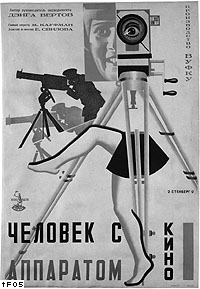
Stenberg brothers, poster for The man with a movie camera, 1929.
The poster for Vertov's famous film about the omnipresent camera offers a summarized view of early twentieth-century's drive towards totalizing, capturing, mechanical vision. A man is aiming a movie camera as if it were a machine gun; a camera lens replaces a human eye of a delighted woman; the tripod, intertwined with half-naked female legs, establishes composition, in which the 'Kino-eye' occupies a privileged position, gazing down at everything underneath. In this poster from post-revolutionary Russia, war, technologically (un)mediated vision and pleasure of reigning gaze converge.
For a vision to be potent knowledge, perceived data alone are not enough: they should be organized and circulated to become valuable information. And it has been one of the principle tasks of graphic designers to organize visual material into meaningful information, and give it an appropriate form for efficient communication.
Throughout the history of modern graphic design and typography, the logic of organizing and circulating the visual has seen a clear parallel, again, in the army. The military has provided designers with two levels of inspiration: first, the actual militaristic communication principles of clarity and efficiency supported by clearly articulated rules; second, the assemblage and management of the army itself as a useful model for organizing raw material.
According to historian Christopher Burke, the underlining principles of typographic modernism, such as standardization and clarity, were greatly indebted to war efforts. Thus Paul Renner, designer of typeface Futura, acknowledged that his experience as a German army officer during the First World War helped him formulate his typographic 'rules': '[the] style of military rules pleased me: ever since the days of Caesar and Napoleon, the language of soldiers has been clear and concise'.
But it was Jan Tschichold who ultimately established the rigorous and didactic language of modernist typography, and the model of designer as a commander-like rule-setter:
1. The new typography is oriented towards purpose.
2. The purpose of any piece of typography is communication…
The communication must appear in the briefest, simplest, most urgent form.
3. In order to make typography serviceable to social ends, it requires the inner organization of its materials (the ordering of content) and their outer organization (the means of typography configured in relation to one another).
4. Inner organization is the limitation to the elemental means of typography: letters, numbers, signs, rules — from the typecase and the composing machine. …
5. Outer organization is the forming of the strongest contrast through the differentiated shapes, sizes, weights (which must correspond to the value of their content) and the creation of the relation between the positive (coloured) formal values and the (white) negative values of the unprinted paper. …
9. Ordering of elements in new typography should in future be based on the standardized (DIN) paper formats of the Normenausschuss der Deutschen Idustrie (NDI), which alone make possible a comprehensive organization for all typographic design.
And consider the spread from his book Die neue Typographie (1928) and how he expressed his refusal of 'centered' typography. A surprisingly direct and bold gesture on one of the abstract and clear diagrams, intended to maximize clarity in communication, betrays the nature of its typographic order, order as imperative.
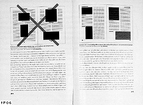 Jan
Tschichold, a spread of Die neue Typographie, 1928.
Jan
Tschichold, a spread of Die neue Typographie, 1928.The argument of one of the most famous metaphors for functional typography, the 'crystal goblet' coined by Beatrice Warde in 1932, is clear: typography should be as transparent as possible, so that it can reveal, rather than hide, what it contains.
To be transparent, a medium had to meet some criteria. First, it had to be unmediated: its content would be delivered without any intervention, and unfold its own meaning by itself in the viewer's mind. Any association or value exterior to the content would not be allowed. Hence no ornament, no symbolic device. Also, it had to be clearly ordered: chaos would create unnecessary noise, distracting the viewer's mind and increasing opacity. Moreover, this order had to follow logical principles to be understood by any rational mind. Any intrusion of arbitrary elements would render it impenetrable, because it would result in unpredictability and force the viewer to struggle with its organizing logic itself, instead of the content.
After World War II, the relatively naïve metaphor of 'crystal goblet' began to give way to more 'scientific' terms such as 'message', 'encoding/decoding', 'redundancy', partly because then newly emerged ideas of information theory and cybernetics started to permeate other areas. Thus, information designer Guy Bonsiepe used the Shannon formula to measure the order when he was redesigning a page of an industrial catalogue at the Hochschule für Gestaltung Ulm in the early 1950s. Aided by the mathematical method, he calculated the clarity of existing catalogue, and proposed a neutral, redundancy-free, well-ordered version of the same page, which was to be used as an example in his paper, 'A method of quantifying order in typographic design'.

Claude Shannon (1917–2001).
Claude Shannon (1917–2001), who provided an analytic method to the project, is a scientist who founded theoretical basis for digital communication and information theory. It was he who formulated the now classic communication model of source – encoder – channel – decoder – destination, which is still offering theoretical guidance to communication engineering, and demonstrated the power of message coding. His contribution to modern technology and science, from digital communication, data compression and storage, to pure mathematics, is too profound to be summarized here, but one interesting area of application was cryptography. As a noted cryptographer, Shannon worked at Bell Labs during World War ii , conducting research projects on secrecy systems. And his 1949 paper 'Communication theory of secrecy systems' is generally acknowledged for giving cryptography a scientific status. It is an ironical coincidence, then, that a method used to render visual communication transparent came from the same mind who also contributed to render communication most opaque. The irony is still more vivid now: even the most immediate mode of digital communication depends on massive, impenetrable network of codes.
After World War II, the feeling that the traditional organizational principle of centralized, hierarchic order did not always work began to spread over different disciplines.

Quickborner Team für Planung und Organisation, office landscape plan for geg-Versand, Germany, 1963–4.
In factories, early twentieth century's idea of organization that emphasized hierarchy of strictly specialized individual workers, governed by top-down decision-making and the chain of commands, began to be questioned in favor of more flexible network of semi-autonomous individuals. In offices, a similar idea was expressed by new concept of spatial arrangement, 'Bürolandschaft' [office landscape] movement of design. In the late 1950s, the Quickborner Team für Planung und Organisation, a German management-consulting group, proposed the idea of completely decentralizing office environment, with the intention of increasing fluidity of information. This plan was followed by the design of new, flexible office furniture, such as Herman Miller's Action Office furniture series.
Of course the bureaucratic nature of workplaces did not disappear with this seemingly 'progressive' move: rather, the technique of control became much more fluid and sophisticated, and now the seemingly 'empowered' individuals' autonomous and fragmented actions could be incorporated to increase the overall productivity.
This movement had its parallel also in the changing conception of army organization. Defects of rigidity were painfully exposed in the Vietnam War, where overly centralized us troops often became paralyzed in front of highly flexible enemy's attacks. As it became clear that inflexible citadel armies could not deal with increased complexity of ever-changing battlefield conditions, moves were made to give more autonomy to small units of soldiers ('platoons') and transform the whole organization to be more like 'meshwork' than hierarchy. Of course, this might have been impossible without innovations in telecommunication technology and invisible force of advanced network, which enabled effective control over individuals in distance and time.
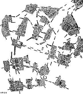
Guy Debord, Psychological map of Paris, 1957.
There is an example where an anticipation of this military conception of fragmentation was merged with the imagination of urban environment. Guy Debord, the key figure of International Situationist movement, made a map of Paris in 1957. It consists of isolated 'zones' linked by paths of 'desire'. Based on insiders knowledge and subjective experiences of city-wanderers, it defies any 'official', birds-eye-view cartography. Debord was a relentless dissident who was highly obsessed with war and military thinking. This 'psychological guide map' looks like a kind of operations map, prepared for the future war on Parisian streets in 1968.
Certainly, we can locate the challenges to typographic modernism and the emergence of 'deconstructivist' typography in this larger development. As the decentralization of computation, management, and army organization was supported by increased assurance of control, the abolition of hierarchy and fragmentation of visual information in typography also presupposed seamless incorporation of conception, design and production into a computer-aided making process on the one hand, and the reservoir of readers' sophisticate visual literacy on the other hand. Now the designers could control all the visual elements without much difficulty to create highly complex information surface, and the readers would decode it using their own knowledge and intelligence; now the designers could argue that their decentered typography without clear order actually communicated better. And the large commercial success of complex typography during the 1990s demonstrates that the development did not necessarily mean empowering the readers 'at the cost of the author': the reading process could still be controlled by the designer/authors, to meet the clients' demands.
All of these instances have a conceptual parallel in the development of what Manuel De Landa calls 'Panspectron': a sophisticate surveillance and control system based on dispersed intelligence-gathering agents and advanced data-processing techniques:
There are many differences between the Panopticon and the Panspectron being assembled at the nsa. Instead of positioning some human bodies around a central sensor, a multiplicity of sensors is deployed around all bodies… The Panspectron does not merely select certain bodies and certain (visual) data about them. Rather, it compiles information about all at the same time, using computers to select the segments of data relevant to its surveillance tasks.
Thus, in relation to surveillance, decentralization in general can be characterized by a couple of developments: collapse of distance between the perceiving agents and the processing center (note that half the century ago the reverse was the case); and consequent dispersion of the processing center itself; dramatically improved performance of communication network; disappearance of evident controlling force and procedure; and the resulting effect of apparent liberation.
As pointed out earlier, movement towards ultimate visibility has been accompanied by growing network of the invisible. Recent development of electronic technology has furthered the dichotomy, by making everything dependent upon the intangible force of electricity, while digital technology has even reduced the physical functions of electricity into purely incorporeal functions of abstract symbols.
Electricity, albeit invisible and intangible, is a real existing physical force that can directly affect the properties of material objects. The dramatic gap between its immateriality and the vividly visible result of its working has created both fear and cult. And designers have played their role in giving visible, comprehensible form to the invisible energy.
In his book Object of desire, historian Adrian Forty examines three different approaches to early electricity design: the archaic, the suppressive and the utopian. Archaic design attempted to disguise the novelty of electronic objects by presenting them in old-fashioned forms, thus referring to the past. The suppressive presented them as parts of some other established forms that served an entirely different purpose. The utopian form suggested that the object belonged to a future and better world.
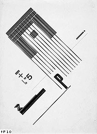
Piet Zwart, Untitled, 1925.
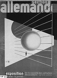
Herbert Bayer, poster for the German section of the 1930 Paris Exposition.
Especially with the third approach, graphic design also contributed to transform the new electronic force into concrete reality. In the works of early modernists such as El Lissitzky, Herbert Bayer or Piet Zwart, electricity appeared as a symbol of modernity, and a source of inspiration for new formal order. They not only frequently worked for electronic companies, but the visual language of their works displayed what might be called as 'electrified aesthetics': purely geometric shapes that perhaps symbolized mathematical exactitude of electronic engineering; daring use of contrasting colors and collision of different elements in an acute angle, as if they wanted to re-create the moment of electric shock; frequent use of such visual motifs as rays, scientific diagrams, wires, and metallic surface. On a more utilitarian side, artist-designer Edward McKnight Kauff produced a series of posters that promoted the benefits of electricity, rendered in a way to suggest the better, electrified future.
Those essentially disguising approaches that Adrian Forty identifies still dominate the design of new electronic products. One can simply look at all those new Macintosh computers, with their 'user-friendly', cheerful, futuristic packages that have nothing to do with their essential functions or meanings, let alone their broader social and cultural implications. More recently, however, an approach to electronic objects that might be labelled 'technological realism' has emerged. British designers Anthony Dunne and Fionna Raby's recent book Design noir exemplifies the approach.
Critical design is related to haute couture, concept cars, design propaganda, and visions of the future, but its purpose is not to present the dreams of industry, attract new business, anticipate new trends or test the market. Its purpose is to stimulate discussion and debate amongst designers, industry and the public about the aesthetic quality of our electronically mediated existence. It differs too from experimental design, which seeks to extend the medium, extending it in the name of progress and aesthetic novelty. Critical design takes as its medium social, psychological, cultural, technical and economic values, in an effort to push the limits of lived experience not the medium.
Their interest in usually neglected aspects of electronic objects has generated various projects on an electromagnetic spectrum, which they consider as a real, inhabitable space 'with its own electroclimate and electrogeography'.
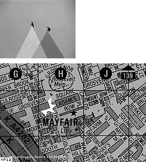
Dunne & Raby, Tuneable cities, 1999: still from Radio birds video; and illegal bugging device map.
If Tuneable cities is more about experiencing and occupying electromagnetic spectrum, another project Faraday chair proposes the idea of 'negative radio', a shelter from the prevalent force of electricity. This 'cage' creates radio-free, empty space, separating the inside electronically by conductive material coated on the surface of the transparent case. The designers ask: 'if the inside is empty, what is outside?'
Images from scherware.com.
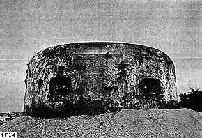
Paul Virilio, photograph of a German bunker built on a French seashore nearby St. Nazaire during the Second World War. Reproduced in his book Bunker Archaeology, 1994 [1975].
Any status of insecurity would make one nervous and anxious. Especially when the source of disturbance is constantly invisible and unidentifiable, the question of security could foster irrational suspicion of those things that have apparently nothing to do with security. And this particular psychological feature has been a characteristic of a large part of post-war world. General Ripper, for example, whose paranoid suspicion of contaminated 'bodily fluids' leads to World War III in Stanley Kubrick's film Dr. Strangelove, provides a stark portrait of security-obsessed Cold War militants. Also, the astonishing montage of numerous military training and propaganda footage delivered by the cult film The atomic café (1982) demonstrates that the anxiety and suspicion was actually the psychological basis of post-war us propaganda about the atomic bomb. The more recent film A beautiful mind (2001) contains a fascinating scene where the paranoid mathematician John Nash works in his office completely covered by magazine and newspaper pages; with a delusion of a secret agent, he obsessively scrutinizes newspapers and magazines, identifying suspicious word-patterns and deciphering hidden messages coded by Russian spies.
The same psychology can be noticed in spy and detective literature, and other popular narratives related to various 'conspiracy theories', especially flourished during the last century. What you see is not what it really is; truth is out there – this kind of epistemological suspicion has promoted what literature theorist Shawn J. Rosenheim calls 'cryptographic imagination'.
This cryptographic imagination can also be found in the realm directly related to graphic design. The history of alphabet symbolism examined in Johanna Drucker's book The alphabetic labyrinth is based on the assumption that alphabetic letters can codify a wide range of cosmological, religious, and philosophical meanings in their forms.
Encryption has become an essential element of electronic network communication. The rise of on-line commerce would have been impossible without the power of coding. Its promise of security helps us to readily give out our most personal information. It is not always apparent, however, exactly how and under whose control it works. In addition, despite assertion to the contrary, the system can always be compromised and the information can always be intercepted. This sense of fundamental insecurity and fluidity characterizes our predominant means of communication. Paul Elliman's Grrrrr.list addresses this nature of 'network writing'. Grrrrr.list is a kind of 'live message board', composed of intercepted messages originally posted upon other message boards dispersed in the Internet. You cannot directly post on the list; it does not offer any writing function. But your message containing the phrase 'grrrr', regardless of what the actual message is or where you post it, will be automatically picked up and added to the list. Suggestively, the website proclaims that '[this] is an insecure document that is not encrypted and offers no security protection.'
Electronic communication can also physically leak from the hardware. The Surveillance Technology Group, a security consultant company, is selling 'Computer Intercept System', which can scan and analyze the information radiating from the computer:
Without entering the premises, electromagnetic radiating from unshielded computer screens and ancillary equipment can be intercepted from a remote location. The Computer Intercept System's highly sensitive receiver logs all radiating signals into its 100 channel memory. These emissions are then stabilized, processed and reassembled into clear reproduction of the intercepted data onto its built-in monitor.
One could point out the complex relationship between privacy and surveillance, or the conflicting interests in security on different levels. If the privacy and security on personal level are under the threats of widespread surveillance technology, as many surveillance protesters argue, is it not the same desire of security that has motivated the development of the technology itself? As the 'institutional' surveillance breaks into what has previously been considered very private and secure, individual anxiety about personal security will increase, perhaps to the degree of requiring even more enforced system of counter-surveillance. Maybe this kind of arms race is the most accurate picture of what has been developed around the issue of surveillance.
Julia Scher's web-based project Wonderland recognizes this complicated nature of security and surveillance. This website introduces a range of 'products', designed for security-aware, bodily-fluid-anxious new general Rippers. Under the motto 'Your void is our workplace', it provides Reverse Psychology Debabelizer that 'allows immediate detection of misleading information', Insecurity Complex Retraining Program, an 'educational self-help program' for those who are overly anxious about security, and Smart and Pink Urban Camouflage, which, obviously, cannot hide anyone. Rather than simply bedeviling surveillance, it provides a more ironic, satirical portrait of a security-obsessed society, encouraging the viewers to reflect themselves.
I have tried to address the complex relationship between surveillance, security, and graphic design, by discussing examples of investigations into new ways of seeing from the last century; changing techniques of organization; transparency of medium as a value of graphic design and its irony; increased invisibility and its relation to the drive towards omnipresent vision; and the psychological basis of a security-obsessed, surveillance society. Also, I have examined various responses to these developments from artists and designers, sometimes locating well-known examples in a new context, and sometimes introducing those examples that have rarely been discussed in graphic design literature.
Let me go back to the initial metaphors of light and shadow. Presumably, shadowplay is one of the oldest forms of play, perhaps existing since mankind discovered the relationship between light and shadow. An object is placed in the light, but nobody cares about the revealed surface of the object: it is the shadow cast by the object that conveys the meaning.
Some of the examples I have discussed function in a similar way. They expose themselves in the light of surveillance, the invisible force field of power, instead of hiding. Oftentimes, however, their true significance lies hidden in the shadow they cast. While the habitual, scrutinizing eye is satisfied with what it is seeing in the light, and trying to expand the scope of light to reach the most recessed corner, an unexpected meaning or effect suddenly emerges behind the already revealed surface, from the shadow of the most evident.
At the same time, the shadow players really need the light: without it, the performance itself becomes impossible. Whether they are merely the illumination's by-products or not, I cannot say. One thing is clear, however: even if they are depending on what they are engaging with, and limited in their capacity to change, at least they understand, consciously or not, the relationship between the watcher and the watched, the power and the vision, and by letting others share the understanding, contribute to keep the opportunity to change the relationship open.
Bibliography
De Landa, Manuel. War in the age of intelligent
machines. New York: Zone Books, 1991 × Extensive discussion about military
research of machine vision and other intelligent weapons and its historical,
social and cultural implications.
Drucker, Johanna. The alphabetic labyrinth: the
letters in history and imagination. London: Thames and Hudson, 1995 ×
A history of alphabet symbolism, the idea that letters can codify a wide
range of cosmological, religious, and philosophical meanings in their
forms.
Dunne, Anthony & Raby, Fionna. Design noir:
the secret life of electronic objects. Basel, Boston and Berlin: Birkhäuser,
2001 × This book by the British industrial designers document various
strategies for 'critical design', a practice that engages with current
technological development and promotes public debates on its social values.
Forty, Adrian. Object of desire: design and society
since 1750. London: Thames and Hudson, 1995 × Forty traces how product
design has embodied dominant ideologies of the times, and how design has
helped transform new technologies, including electricity, into something
that the public can easily accept.
Foulcault, Michel. Discipline & punish: the
birth of the prison. New York: Vintage Books, 2nd edn, 1995; originally
published in France as Surveillance et punir: naissance de la prison,
1975 × A seminal text traces the history of surveillance and techniques
of control.
Hookway, Branden. Pandemonium: the rise of predatory
locales in the postwar world. New York: Princeton Architectural Press,
1999 × An extensive research on decentralization in many disciplines from
computer science, urbanism, office design to typography.
Kinross, Robin. Modern typography: an essay in
critical history. London: Hyphen Press, 1992 × A thoughtful history of
rationalization in typography from the eighteenth- to the twentieth-century.
McLuhan, Marshall. The Gutenberg galaxy: the
making of typographic man. Toronto: University of Toronto Press, 1962
× An influential text on how the visual has become a dominant sensory
data during the modernity, partly due to the printing technology.
Moholy-Nagy, Lazlo. Vision in motion. Chicago:
Paul Theobold, 1946 × Excellent overview of early modern art and design
by one of the prominent artist/theoretician of the movement; especially
useful to understand early twentieth-century's various attempts to capture
time and movement.
Rosenheim, Shawn James. The cryptographic imagination:
secret writing from Edgar Allan Poe to the Internet. Baltimore: Johns
Hopkins University Press, 1997 × In this book, Rosenheim outlines what
he calls 'cryptographic imagination'. Stemming from the tradition of secret
writing, it is an attitude towards language that acknowledges its opaqueness
and slipperiness, endlessly inquiring what actually is behind the apparent
meaning of a text.
Tschichold, Jan. The new typography: a handbook
for modern designers. Berkeley and Los Angeles: University of California
Press, 1995; originally published in German as Die neue Typographie, 1928;
English translation by Ruari McLean × A classic literature of typographic
modernism; worthy of re-visiting from a bigger perspective of mechanization
of word-processing and militarization of graphic communication process.
Vertov, Dziga. Kino-eye. Annette Michelson (ed.),
Berkeley and Los Angeles: University of California Press, 1984 × An anthology
of writings by one of the most radical avant-garde filmakers from revolutionary
Russia. His writings, as well as his films, have a big implication about
the mechanized vision and modern surveillance.
Virilio, Paul. The vision machine. London: British
Film Institute, 1994 × Historical account of how human vision and its
functions have been transformed throughout the modernity; critical understanding
of the development of the machine vision.
Virilio, Paul. War and cinema: the logistics
of perception. London: Verso, 1997 × An analysis of how the cinematic
techniques have supported military strategies and surveillance, and how
the military and war have affected the development of modern cinema.
Benjamin, Walter. 'On some motifs in Baudelaire'
in: Illumination. Pimlico edn, Hannah Arendt (ed.), London: Pimlico, 1999
× Through the analysis of Baudelaire's poems, Benjamin attempts to explain
the nature of modern metropolis in terms of increased sensual excitement,
and diagnose the resulting crisis in perception.
Buck-Morss, Susan. 'Aesthetics and anaesthetics:
Walter Benjamin's Artwork essay reconsidered', in: October: the second
decade, 1986–1996. Rosalind Krauss et al. (eds.). Cambridge Mass:
The MIT Press, 1997 × In this essay, Buck-Morss elaborates Benjamin's
diagnosis of the crisis in perception from the late nineteenth century
to early twentieth-century, and examines various attempts to manage the
crisis, including Fascism.
De Landa, Manuel. 'Meshworks, hierarchies, and
interfaces', in: The virtual dimension: architecture, representation,
and crash culture. John Beckmann (ed.). New York: Princeton Architectural
Press, 1998
× The philosopher discusses two contrary ideas of organization, 'hierarchy'
and 'meshwork', in computer interface design and other fields.
Kinross, Robin. 'The rhetoric of neutrality'
in: Design discourse: history, theory, criticism. Victor Margolin (ed.).
Chicago and London: The University of Chicago Press, 1989 × An excellent,
and also critical, introduction to information design and its claim for
'neutrality' in typographic expression.
Williamson, Jack H. 'The grid: history, use,
and meaning' in Design discourse × This essay offers a historical account
of grid system as a symbolic device.