Now_
Every second
Here_
Leuven
Min Choi and Sulki Choi
Whenever we try to take the slogan ‘age-old Leuven,
alive and kicking’ as a meaningful argument, we come to encounter
difficulty. There’s no problem in the ‘age-old’ part: it’s
a fact, as solid as the magnificent town hall. It’s the ‘alive
and kicking’ part that makes us wonder. Does it mean anything particular?
Can you think of any city that is not alive and kicking, but dead and
inert? Obviously we can’t. Both of us have spent some years of time
in a small American town called New Haven, widely regarded as one of the
most boring and unattractive cities in the US. But what we found there
was much life, and the same holds true to any other cities we have experienced.
At least for us, every city is alive and kicking: in a sense, that is
the very nature of the city.
On this reflection, we find ourselves striving for a more convincing case
of the ‘alive and kicking’ aspect of Leuven, leaving its historical
heritages and age-old charms aside. And here we’re supposed to be
talking about the ‘cultural life’ of the city. It has been argued
that ‘culture’ is not merely about the beautiful or the precious,
but also to be found in the way we work and play, the way we wear, eat
and drink: in short, the way we live our daily lives. Then we can expand
the arena of cultural life from museums and galleries to the ‘streets
level’ locales: libraries and newsstands; video rental shops and
record shops; clubs and bars; living rooms and wardrobes; even the dwellers’
handbags and pockets. Can we grasp and communicate the cultural life of
this microscopic scale? Can we reflect and express these local and banal
activities in such a way to form a collective ‘cultural identity’
of a city as a whole? These are the initial questions we’re having
in mind in approaching the problem of ‘cultural communication of
Leuven’. Following are some methodological notes we prepared to answer
the questions, at least partially, in the near future.
Emergence
The city is often compared to the living organism. Indeed, recent scientific
developments have provided us a better understanding of what seems to
be consistent in diverse ‘complex’ systems from the ants’
colony, human brain, computer software to the city. It is a self-organising
process, by which simple local events conjure up a higher-level order
without relying on any central plot or global perspective.[1]This
process, ‘the rise of a system that cannot be predicted or explained
from antecedent conditions’, is called ‘emergence’.[2]
And many have noticed this emergent process working in the city, with
its suburban clusters, for example, organising themselves in time without
any dictating plan.
Perhaps the basic principle of emergence, or self-organisation, is best
illustrated by the well-known Game of Life, designed by John Conway
in 1970.[3] This game
is ruled by a straightforward algorithm that regulates each cell’s
behaviour: first, a cell with one or no neighbour dies (for loneliness);
second, a cell with four neighbours also dies because of overpopulation;
third, with three neighbours it survives; fourth, an ‘empty’
cell with three neighbours becomes populated. When you run the program,
you will see some unpredictable patterns emerging, out of each cell’s
uncoordinated behaviours. Sometimes, the resulting pattern shows a well-developed
order which may seem as if planned in advance.
Some philosophers have attempted to explain the whole universe and the
mystery of life in terms of this self-organising process.[4]
But their theory might be less important here, than its practical implications.
In the world of politics, some activists of the so-called – and wrongly
labelled – anti-globalisation movement have been advocating the idea
of decentralised consensus decision-making, in place of the rule of majority.[5]
There is no central organisation or party apparatus to this movement,
but it didn’t deter the thousands of protesters gathered in Seattle
(1999), Genova (2001), and New York (2002), without any central command.
In the field of computer engineering, the ‘open source movement’
is based on the premise that spontaneous collaboration between willing
individuals is more productive than closed and protected authorship.[6]
There are some basic rules to this movement: you can freely access to
the source of a software, and modify or improve on it for your own purpose;
then the result should be returned to the public, to be shared and modified
again. Subsequently, the whole community will be benefited, with the software
getting increasingly smarter, as it absorbs feedbacks and local intelligence.
The free Internet encyclopedia Wikipedia
is a good example of this ‘peer-to-peer production’. It is free
to view, of course, but you can also freely contribute your own article,
or even edit the existing articles. Started in January 2001, Wikipedia
has grown to contain, at the time of writing, 182,465 articles in the
English version only.
In urban planning and map-making, we ourselves saw a glimpse of possibility
in the generative psycho-geographic practice a couple of weeks ago. The
map of surveillance cameras in New York City, generated by numerous individuals’
spontaneous participations and reports, shows the degree of comprehensiveness
that is unthinkable by a single researcher’s mind.[7]
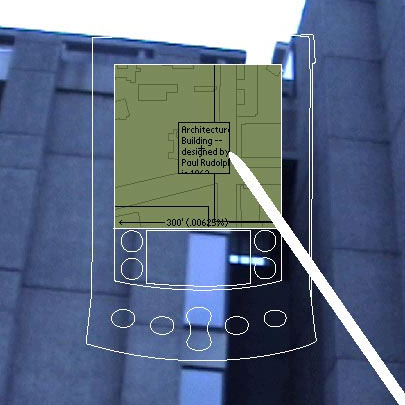
A similar example is the New York-based designer Rebecca Ross’s proposal
for a PDA-based tour of Yale University. [Fig.
1] Tourists of the University would be given Palm Pilots, by which
they could contribute their own experiences with particular locations:
‘Over time, the accumulations of these experiences becomes a community-authored,
or decentralised, map’.[8]
None of these would be relevant if not for the fact that we’re dealing
with the issues of identity and the city, and indeed, the identity of
a city. Without relying on the concept of ‘self-organisation’
or ‘emergence’, our very instincts would tell that the identity
of a city cannot be created overnight by certain individuals and imposed
upon from above. To us, it seems only decent to assume that the culture
of a city – distinctive or not – is something accumulated over
time, out of numerous unconscious activities and events – including
the banal and non-cultural ones. In this respect, the above examples seem
to suggest a new model for identity design, especially when it’s
dealing with such complex entity as a city. Instead of creating and imposing
certain visual attributes, can we design a system that would allow a city
to speak for itself? Instead of pondering on some ‘true’ representations
of a city, can we let the city directly present itself? Can we conceive
an ‘self-organising network’ for identity program, itself resembling
the city’s behaviour, and let the image of the city unpredictably
emerge out of the multiple inhabitants’ unplanned and unorganised
activities?
Multiplicity
For over decades, identity design has been one of the most lucrative and
influential business areas in graphic design. Its ability to create a
consistent ‘corporate image’ over a wide range of activities
and products has been a shining testimony to the profession’s competency.
In order to achieve such consistency, identity design has tended to pursue
the fixed, the static, and the homogeneous. All the products from one
manufacturer should somehow look the same with each other; the employees
of the company should share a common spirit manifested by their uniforms
and their standard letterheads; not only here, but also to the end of
the world; from now to eternity.
In reality, this dream has never been fulfiled: every now and then local
situations would force modifications and negotiations of global rules;
and it has never been free from plagiarism. One can say that the mixture
of the homogeneous and the heterogeneous, the fixed and the flexible,
has always existed in the project of identity design. Recently, however,
we have seen more conscious efforts to increase the open and flexible
elements in the mixture. Maybe it’s partly because the notion of
fixation itself has become unpopular and undesirable. But the practical
impossibility of predicting all the local situations has also become increasingly
clear, especially in the case of complex organisations. And since we’re
now dealing with one of the most complex organisations, it would be worthwhile
to be reminded of some examples of identity program that attempt to embody
the aspects of change and openness.
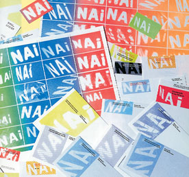
Bruce Mau Design’s identity for the Netherlands Institute of Architecture
(1993) consists of ‘100 logos, 1000 colours’ to reflect the
organisation’s multi-faced activities.[9]
[Fig. 2] Instead of a
single sharp-edged logo, they created multiple projection images that
would serve as a reservoir for different choices, allowing much flexibility.
Additionally, this set of almost amorphous logo-images would promote the
sense of movement and change, while still maintaining a substantial degree
of consistency. This mixture of consistency and freedom must have been
quite fresh a decade ago, and the fact that it’s still being used
may suggest its enduring conceptual strength.
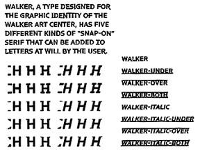
The identity program of the Walker Art Center in Minneapolis (1995) takes
more definitely typographic approach.[10]
[Fig. 3] The most important
element of this program is a digital font developed by Mathew Carter.
The font contains, in addition to the standard Roman characters, various
elements that can be ‘snapped on’ to the characters to form
serifs or horizontal rules. Essentially, it was to give the in-house designers
a ‘toolkit’ to work with, rather than a finished product. The
Walker typeface would allow a sufficient room for variation, which was
desirable given the diverse nature of the organisation’s activities.
To our view, however, this project is more interesting in terms of the
new possibility for typography, than as a radical rethinking of identity
design. Too much of the characteristic is already determined by the core
letterform, rendering any other variations marginal.
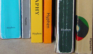
We can find a more extreme case in the London-based publishing house Hyphen
Press’s identity: or, the lack of it. [Fig.
4] Perhaps partly out of resistance to the prevalence of corporate
identity in design culture, it has never devised a fixed logo as a focal
point of ‘house style’.[11]
Instead, certain consistency over products is achieved more subtly by
the editorial policy, the books’ material quality and typographic
style – and most of all, a common ‘attitude’ towards design
and culture shared by its authors and the publisher. It should be quickly
noted that Hyphen Press is a fairly small adventure, with a limited range
of products, which would allow them a better control while avoiding militant
practice of corporate identity.
To the contrary, we can safely say that the Massachusetts Institute of
Technology (MIT) is indeed a huge and complex organisation. As a hothouse
of the open source movement (they are putting their course materials open
to the public), the MIT would appear only contradictory in keeping a fixed,
static identity. Although its current identity doesn’t show much
difference to those of other similar institutions, they have been maintaining
an interesting design policy for their web
site.[12] Anyone
– whether in the MIT community or not – can contribute one’s
own design for the main graphic element of the front page, which changes
every day. According to their design philosophy statement, the changing
appearance of the web site ‘reflects the diversity of MIT itself.
It does not represent a single voice, but rather many voices, showing
the Institute in a full and evolving way’.[13]
To our view, this idea seems more interesting than the ubiquitous ‘customising’
functions, because it’s about sharing your own creation with the
community, not about appropriating the generic for your own interest only.
Whether the design is beautiful or not is beside the point, but one may
wonder if it can be even more flexible, not only at the surface but also
on the structural level. Maybe in the near future…
Data-driven design
Attempts to introduce flexibility and fluidity in identity design, including
some of the earlier examples, have tended to display randomness and arbitrariness.
They may increase functionality of the program, and promote the sense
of multiplicity, but do not encourage more meaningful ‘reading’
of the dynamic form, because their visual properties are not related to
the changes in the world. The opposite effort to seek motivations in the
real-world events has been pursued in what is often called ‘data-driven
design’. Loosely associated with the field of information design,
it aims to visualise the invisible flow of data, and/or to embrace data
as a determinant factor in formal decisions. Sometimes, it doesn’t
stop at articulating information in a neutral way, but goes on to explore
the nature and the implications of what it expresses.
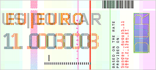
Curen_t_cy, created by Sung Joong Kim in 2002, is a machine that
issues the ‘smart money’.[14]
[Fig. 5] Specially designed
software tracks currency exchange rate information from the Internet,
and inscribes it in the form of encoded marks on the money. The issued
money would display its exact relative value at the time of printing.
Just like a snapshot, it would bear the hallmark of the moment.
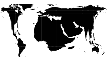
Sulki Choi’s Daily World View (2003) map project is an example
of data-driven design that comments on the nature of the information it
deals with.[15] [Fig.
6] This map transforms itself in such a way to reflect our media-conditioned
interests in certain geographic areas. A search engine scans a designated
Internet news page, and counts the names of cities or countries appearing
on the page. The respective frequencies of the names affect the coordinates
of their locations. As a result, more frequently reported areas, that
is, more heavily interested areas, would occupy more space on the map,
dwarfing other ‘neglected’ regions. On the world map based on
New York Times, for example, the Middle East will appear prominently,
while Greenland will be on the verge of extinction.
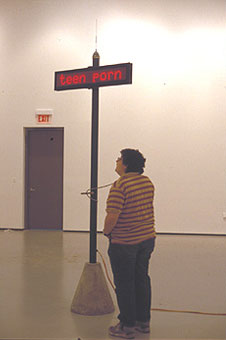
Dan Michaelson and Tamara Maletic’s In the House project ‘taps
on’ the information traffic in the Gnutella community, a peer-to-peer
music-and-file sharing network.[16]
[Fig. 7] Three-dimensionally
erected, it captures search-words in the network and broadcasts them in
real-time, in a public space. It reports on the changing ‘ecology’
of a certain subcultural sector, by visualising the otherwise invisible
ebb and flow of searching activities. If it’s depressing to reconfirm
that one of the most heavily sought items is ‘hardcore’, then
it would be pleasantly surprising to find out that Fleetwood Mac is still
alive and kicking – at least on the Net.
Network-based, data-driven design, as exemplified by these works, may
suggest a new direction for identity design. Conventionally, identity
design has been in the realm of fancy and desire, in that it creates idealised
images, often removed from the reality of the body it represents. If we
could take a data-driven approach to the identity of a city, then we might
be able to relinquish control over image, and instead allow the city to
speak for itself, capturing both the liveliness of a living animal and
the truthfulness of its footprints. One final example demonstrates some
possibility in this respect. Twin
is an interactive typeface created by the Hague-based design studio Letterror,
for the Twin Cities of Minneapolis and St. Paul in Minnesota, US.[17]
Connected to the on-line weather-report, it automatically changes
its form within certain parameters to reflect the change of whether in
the region. When the Twin Cities temperature reaches sub-zero degree,
the characters become formal and severe with its serifs. When it’s
warm, they become more relaxed and informal. Although the typeface is
only associated with the purely natural phenomenon, the commissioning
body found it culturally suggestive as well. Thus Janet Abrams, director
of the Minnesota University Design Institute, states that the typeface
is an ‘acknowledgement that [the Twin Cities are] always in flux’.[18]
If we push this possibility a little further, then we could imagine a
network-based software agent that collects relevant data directly from
the streets, and then visualises it to form a collective cultural image
of the city. In that case, the city itself would become a database, with
a means to express itself. Once given a voice, the city might be able
to speak much more eloquently than any single genius designer could do:
because, as a higher-level structure, a city is much smarter and more
complex than the sum of its dwellers’ intelligence.
What is to be done?
It should be clear now what we can make of all these ideas and insights.
We have argued for emergence and self-organisation as a model for the
identity of a city; the value of its multiplicity and fluidity; and the
possibility of incorporating data-driven design approach into identity
design. In brief, we are envisioning a network-based, data-driven, emergent
and dynamic identity of the city of Leuven.
What specifically can be done in this conceptual framework is still an
open question. We have been using the term ‘identity design’
in its conventional sense, with all those familiar elements and applications
such as the logo, typeface, letterhead, street sign, etc. Would it be
a foolish idea to take these age-old objects as a platform for such a
new approach? Not necessarily. Newness of the new idea might be better
manifested, and its value better judged, on the familiar ground. The logo
of a library that reflects the number of books checked out, a typeface
for a city that indicates different street noises in real-time, or a street
sign that somehow expresses the amount of beer being consumed: all these
can seem gimmicky, lacking the necessary depth and breadth to contribute
to the ‘collective image’ of a city. At least, however, they
might start pointing out a future direction for the identity of Leuven,
triggering a ‘self-organising’ process that will ultimately
lead us to the city as a database in its full sense.
But still, should we imagine something beyond those conventional boundaries
of identity design? Perhaps so. In effect, we have just outlined a new,
more specific design brief for the cultural identity of Leuven: many things
can be conceived in the framework, including those that are unimaginable
now and here.
Illusstrations
[Fig. 1] Rebecca Ross, A Tour of Yale
University
[Fig. 2] Bruce Mau Design, identity program
for Netherlands Institute of Architecture
[Fig. 3] Mathew Carter, typeface for the
Walker Art Center
[Fig. 4] Publications from Hyphen Press
[Fig. 5] Sung Joong Kim, Curren_t_cy
[Fig. 6] Sulki Choi, Daily World View
[Fig. 7] Dan Michaelson and Tamara Maletic,
In the House
Notes
[1] For an accessible
introduction to this process, see Steven Johnson, Emergence: the Connected
Lives of Ants, Brains, Cities, and Software, New York: Touchstone,
2001.
[2] Encyclopædia
Britannica. Retrieved December 14, 2003, from Encyclopædia Britannica
Premium Service <www.britannica.com/eb/article?eu=33091>.
[3] This game seems to
have multiple origins, but Conway’s one is the best known example.
It was first published in Martin Gardner, ‘Mathematical Games: the
Fantastic Combinations of John Conway’s New Solitaire Game “Life”’,
Scientific American, no.223, October 1970, New York.
[4] See, for example,
Manuel De Landa, A Thousand Years of Nonlinear History, New York:
Zone Books, 1997; and the same author’s Intensive Science and
Virtual Philosophy, New York: Continuum, 2002.
[5] See David Graeber,
‘The New Anarchists’, New Left Review, no.13, January/February
2002.
[6] The open source movement
was first founded in 1998 by a number of people who wanted to ‘persuade’
the protective industry by proving the collaborative production’s
superiority. The open source movement gained its crucial momentum in the
popularity of Linux operating system. See for more information: <www.opensource.org>.
[7] For further information
on this project, see: <www.mediaeater.com/cameras/info.html>.
[8] From Rebecca Ross’s
personal
web site.
[9] Project description
in the web
site of Bruce Mau Design; see, also, Will Novosedlik, ‘The Producer
as Author’, Eye, no.15, 1994.
[10] See, for more detailed
report, Moira Cullen, ‘The Space between the Letters’, Eye,
no.19, 1995, pp.70–7.
[11] It would be interesting,
in this view, to see how the publisher of Hyphen Press, Robin Kinross,
perceives the culture of design publishing. See Linda Eerme and Robin
Kinross, ‘The Architects of the Book’, originally published
in Domus, no.847, April 2002, and then posted on the Hyphen Press
web
site.
[12] The same example
is discussed in an essay proposing a new model for graphic design practice
based on the ideas of the open source movement. See David Reinfurt, ‘One
Possible Scenario for a Collective Future’, Dot Dot Dot, no.5,
2002.
[13] Web site philosophy
statement by Suzana Lisanti and the MIT home page team, published in their
web
site.
[14] For more information
on this project, contact its designer/programmer Sung
Joong Kim.
[15] For more information
on this project and its demonstration movie, see the web
site.
[16] In the House
is part of the United Air Project, initiated by Michaelson and Meletic
as an effort to develop multi-dimensional data-driven design approach
in urban contexts. For more information, see the project proposal posted
here.
[17] In addition to
this typeface project, the University of Minnesota Design Institute has
initiated many design projects that are relevant to current discussion
on city identity.
[18] Quoted in Matthew
Mirapaul, ‘Is It About to Rain? Check the Typeface’, New
York Times, July 24, 2003.