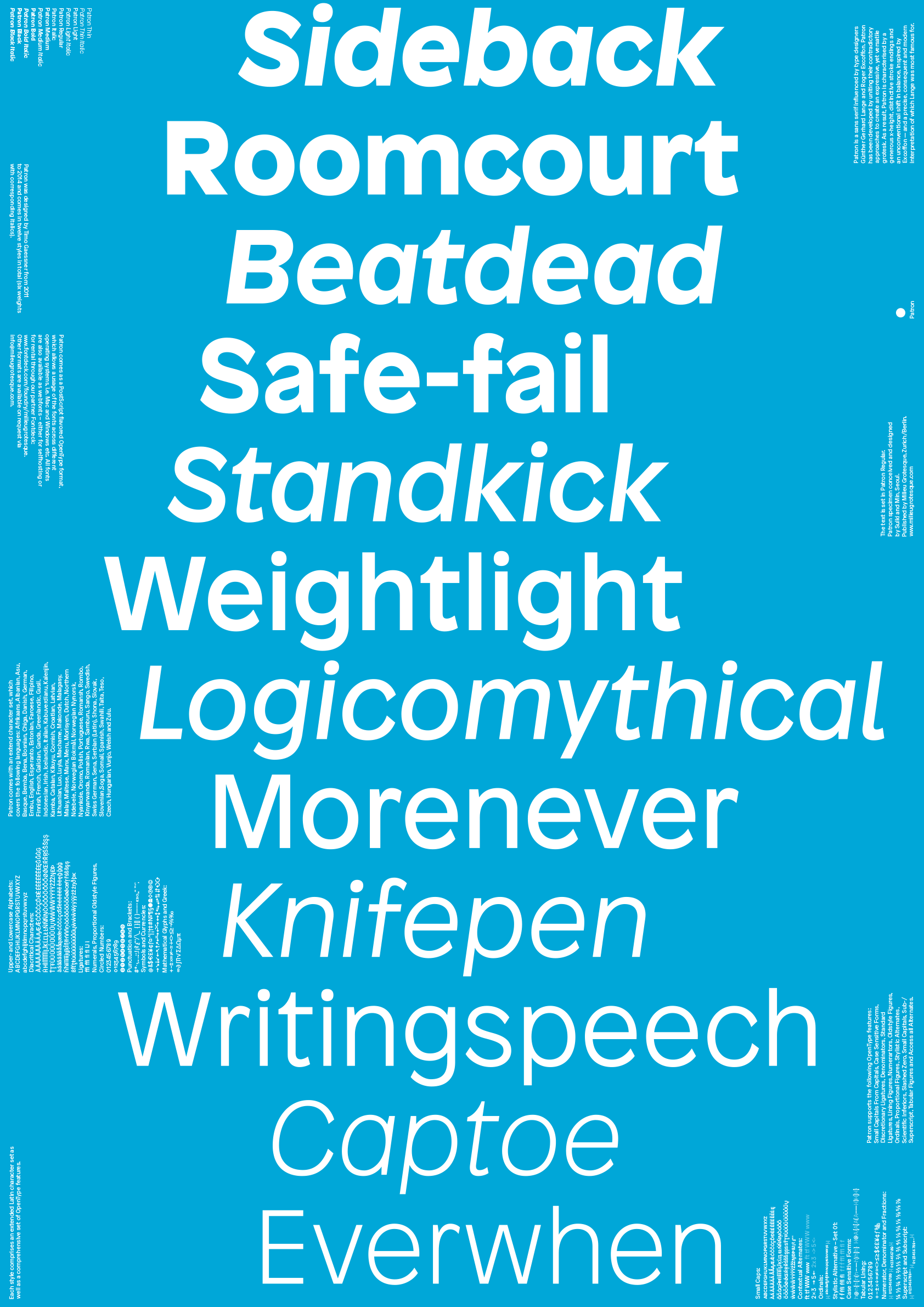


Patron
- 2014
- offset lithograph
- 2 versions, each 594 x 841 mm (A1), double-sided
According to its designer, Timo Gaessner, Patron is a “sans serif influenced by type designers Günther Gerhard Lange and Roger Excoffon. Patron has been developed by uniting their contradictory approaches to create an expressive, yet versatile grotesk.”
For its specimen poster, we used single-word oxymora to reflect the idea of contradictory qualities combined into a single typeface. We selected twelve English oxymoron words, and arranged them in a way that respects the folding lines. Detailed information about the typeface is distributed on the eight A4 pages. The same content is repeated on the backside, except that the oxymora are internally reversed (“backside” to “sideback,” for example) to become twelve new oxymoron nonwords.
- Project type:
- poster
- Commissioner:
- Milieu Grotesque