- exhibition catalog
- 2014
- offset lithograph, adhesive bound
- 186 x 243 mm, 240 pp
Before/After Mass Studies Does Architecture
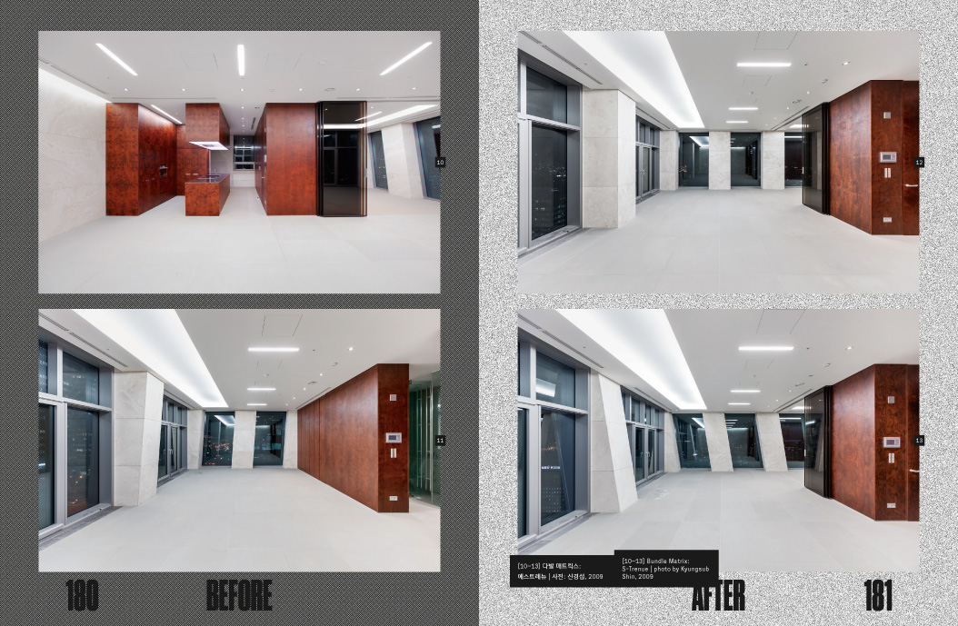
A mid-career survey of the architect Cho Minsuk and his firm Mass Studies, the exhibition was divided into two sections: “Before” (white room) concentrated on ideas and process, and “After” (black room) showed various aspects of completed buildings, including how they are actually used and how they are portrayed in the media. The graphic identity reflects the sharply differentiated exhibition structure: before/after, white/black, void/solid, outlines/tonality.
The design of the catalog explores the notion of symmetry and cycling. On the front cover, a steep graph that shows the surging number of internet users in Korea from 1990 through 2012 works as a before-after, white-black divider; in sharp contrast, the back cover shows the diminishing investment in construction in Korea during the same period.
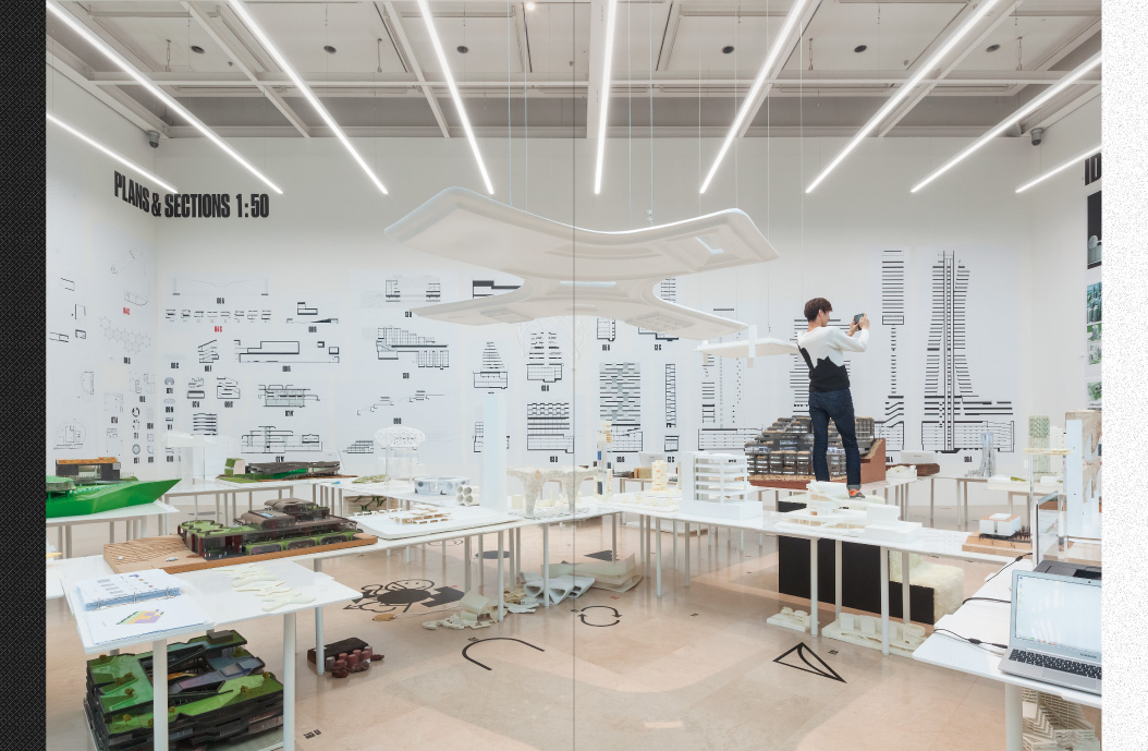
Inside, the page background gradually shifts its tone as the book proceeds, from black to white on the rectos and white to black on the versos. It reinforces the cyclic structure of the content: from sites to design to realization and then to sites again; the empty venue before the show on the first pages; and the same space now full of works after the installation on the last pages. The left-hand pages express the tone with diagonal lines; the right-hand pages use random dots. The contrasting screens also add an interesting texture to the edge of the book.
- Project type:
- publication
- Printer:
- Top Process
- Commissioners:
- Ahn Soyeon
- Cho Minsuk / Mass Studies
- Pai Hyungmin
- Plateau


