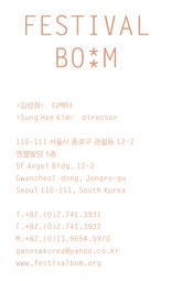


- Identity system and stationery
- 2008
- offset lithograph
- Various sizes
Festival Bo:m
The logo for the new, ambitious performing arts festival is unpredictably light and cautious, almost fragile like a new shoot (“bom” can mean “spring” in Korean). For some reason, it was decided that the logo should maintain a certain size throughout the printed applications: it would be repeated, rather than enlarged, to reinforce its visual presence. Thus, there is only one logo on the business card, but there are ninety-nine logos on the poster.
- Project type:
- identity
- Typefaces:
- Arita Dotum
- Letter Gothic
- Printer:
- Top Process
- Commissioners:
- Festival Bo:m
- Kim Seonghee