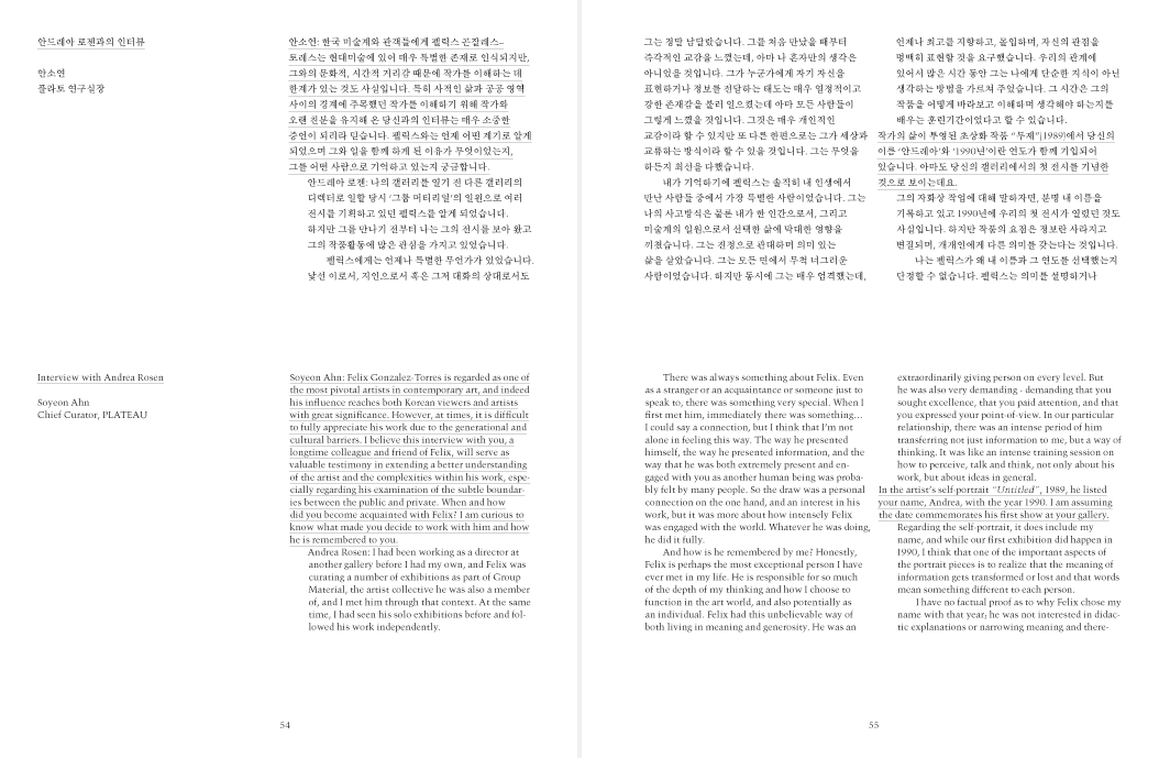


Félix González-Torres: Double
Exhibition catalog
- 2012
- offset lithograph, adhesive-bound
- 186 x 243 mm, 152 pp
Félix González-Torres is known to have used the typeface Trump Mediäval in most of his prints. More specifically, it was its Bold Italic variant that he used for his texts. Legend has it, though, that there was no proper “bold italic” variation of Trump Mediäval available to him, so he had to use a mechanically slanted roman instead.
We reversed this process. While González-Torres mechanically slanted a roman font to create a strange italic, we took the proper italic of the same typeface and mechanically “un-slanted” it to create a slightly strange roman.
- Project type:
- publication
- Paper:
- Rendezvous
- Vent Nouveau
- Printer:
- Top Process
- Commissioners:
- Ahn Soyeon
- Plateau

