

Jan van Eyck Academie
Identity system, stationery, and building signs
- 2009
- offset lithograph
- paint
- Various sizes
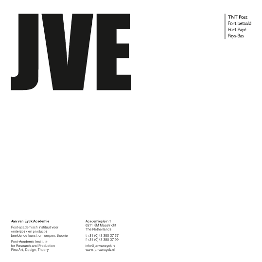
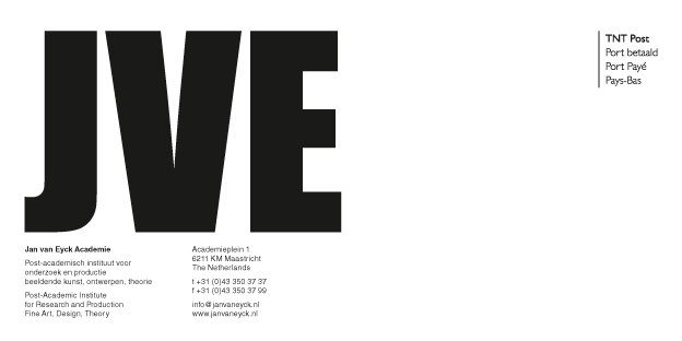
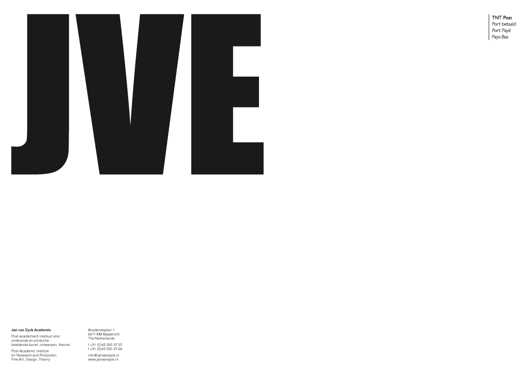
The new graphic identity of the Jan van Eyck Academie was centered on a simple and straightforward logotype: the acronym JVE set in a commonplace typeface, Impact, in a conspicuously large size. The brief had asked for an identity system to reflect the flexible and open-ended nature of the Academie. Apparently, our new logo was an unexpected, if not outright wrong, answer: it represented the Academie in a pretentiously absolute and confident manner. It was so distanced from any perception of the theory-laden Academie that it, ironically, began to look appropriate.
But the near absurdity of the weighted-up appearance was not just an ironic statement. It did aspire to be a firm anchor, a clear reference, a visible pointer for the very physical place for people and ideas to gather, and to claim a certain – temporary? – autonomy in a world of constant flux.
This identity system was nominated for Dutch House Style Prize 2009.
- Project type:
- identity
- Commissioner:
- Jan van Eyck Academie
- Production coordinator:
- Jo Frenken

