Locus Solus
- 2020
- offset lithograph, sewn in sections and cased, in foil-stamped dust jacket
- 150 x 210 mm, 320 pp
The dust jacket displays a subtle contrast between the symmetric, serifed typography (set in Optique by Noh Eunyou) and the dotted double R’s, which are positioned and foil-stamped gently disregarding the arrangement of the printed elements. Taking off the dust jacket reveals a hidden meaning of the initials: each R consists of the same twenty-six alphabet letters, whose order is reversed between the two initials – a simple nod to the author’s technique: “I chose two similar words. For example billard (billiard) and pillard (looter). Then I added to it words similar but taken in two different directions, and I obtained two almost identical sentences thus….” (R. Roussel, How I Wrote Certain of My Books, 1935)
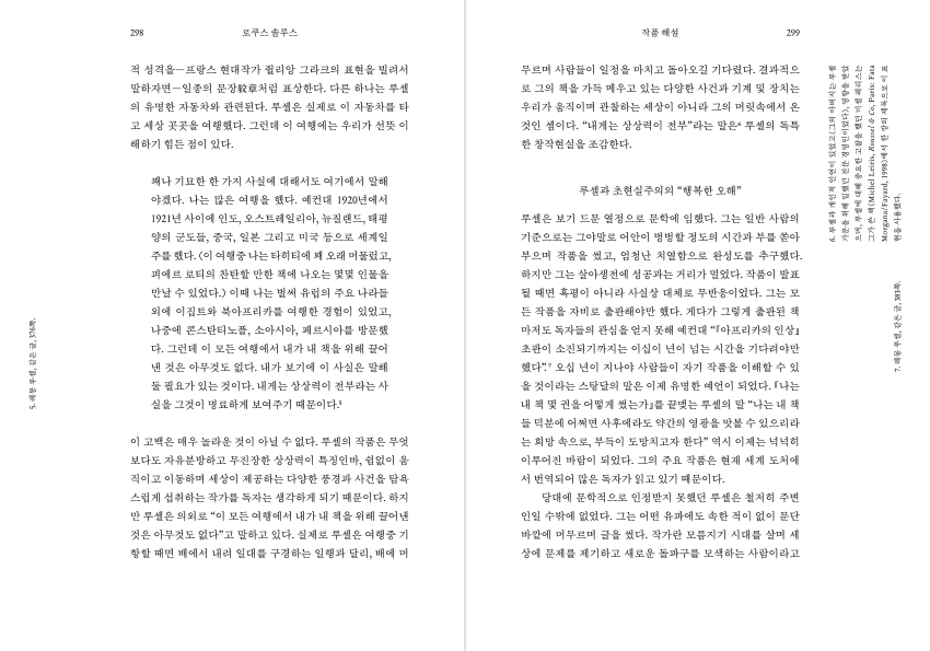
The theme of contrast continues inside. The typography is conservative, even slightly archaic, for the historic avant-garde work: in the rather formal dress, the radical nature of the text would manifest itself more clearly, and perhaps more interestingly, thanks to the incongruity. The typeface (old-style myeongjo in combination with Monotype Fournier), the spacing (slightly loose), and the arrangement (centered and justified) all help give the wildly experimental text a calm and assured appearance. A sense of modernity, however, is evoked by the way the notes are treated: rotated and placed in the wide side margins.
- Project type:
- publication
- Author:
- Raymond Roussel
- Typefaces:
- Fournier
- Optique Display
- SM Sinmyeongjo
- Printer:
- Hanyeong Printing, Goyang
- Binder:
- Gyeongil Binding
- Commissioner:
- Munhakdongne
- Page composition:
- Injin
- Exhibition:
- Group Theory (DDP, Seoul, 2021–22)


![]()
