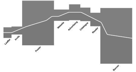
River
Cartographic bridge: standard map sign for bridge
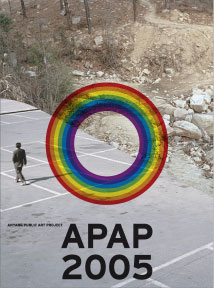
Ideal bridge: rainbow
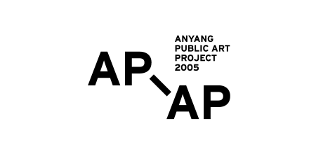
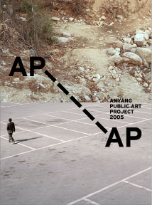
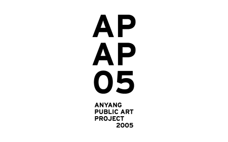
Typographic bridge: hyphen
Contextual bridge: or, no bridge at all – until it crosses over a border
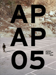
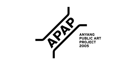
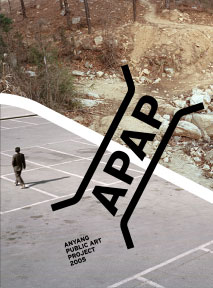
APAP 2005
Identity proposal for an art project
Unrealized
2005
River
Cartographic bridge: standard map sign for bridge
Ideal bridge: rainbow
Typographic bridge: hyphen
Contextual bridge: or, no bridge at all – until it crosses over a border
Proposed ideas for the identity design of Anyang Public Art Project (APAP) 2005. APAP was firt conceived as a project to transform the Anyang Resort (Korea) into a kind of scupture garden, but soon it became a bigger artistic project that many national and international artists, designers and architects were to participate in. The site for the project is divided by a narrow river – narrow, yet the contrast between the two sides is great nonetheless. One side is a natural park, and the other holds recreational infrastructure for the visitors (shops, restaurants, etc.). Not surprisingly, the first APAP took the geographic reality as a starting point, conceptualizing the two sides of the river as ‘Nature’ and ‘Culture’ respectively, emphasizing the dynamic balancing between the two realms.
The river was a natural starting point for our idea, too. First, we proposed that a simplified form of the river would run across all the promotional materials and publications, so that it can formally connect them together, and at the same time create a constant division along the way. Then we also suggested the idea of bridge, as a means to connect the two areas divided by the river. The logo would be a bridge. We proposed five different ideas for the logo: five different bridges.
They liked our idea, and our proposal was almost accepted. But for some practical problems we couldn’t continue to work on this project after this stage. Another designer took it over, and a new identity was established.